Social Justice Poster Research
Posters
The way how posters work is that people promote a event or a message by writing it or drawing it on a big piece of paper and they later put it on public area where people will take a glance at it. The poster must be eye catching so it can grab peoples attention. The reason why some posters may fail is because it could be too vague or simple which doesnt get peoples attention. Some of the elements that a poster needs us Typography, Color, Shape, Contrast, Creativity, Target Audience and many more. These posters might impact my poster design by giving me an idea of what colors work well together and what type of Type Hierarchy I should use.
What makes the first image so unique is how there is different font sizes being used and how the letters are placed on the poster. It shows a connection between the big letters and the small letters like the big letter W connects with ORK making it WORK.
This Poster shows a very intense drawing of a glass with liquid in it. It shows like an explosion effect and the goal of this poster could be to either buy the drink or to avoid the drink.
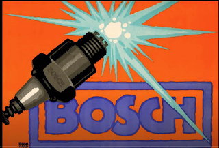
Bosch is an engineering company and this poster is sort of expressing what the company is about and what it focuses on. What I see is like a laser coming out of a piece of metal which makes me think this has something to do with technology.
When I see this poster I see that the target audience is for people who love watching or riding bikes or motorcycles. I see that the image shows different type hierarchy and color in the words.

When I see this poster I think that this poster will be about a local park. I see drawings of many trees which could mean that the park could be big and full of trees,


Comments
Post a Comment