Posts

Showing posts from March, 2024

Call To Action Poster Rough

Image
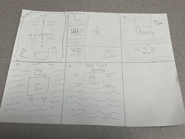
 Poster Rough So what I plan on doing for my Call To Action Poster is to add images of people facing poverty and also adding a QR Code to get people involved in helping solve the issue of poverty. I also plan on adding many other ways they can help fight poverty on the poster by making a list. I plan on adding the definition of poverty n the posters and add a hand drawing on the QR Code to represent giving or receiving donations.  

Social Justice Poster Research

Image
Posters The way how posters work is that people promote a event or a message by writing it or drawing it on a big piece of paper and they later put it on public area where people will take a glance at it. The poster must be eye catching so it can grab peoples attention. The reason why some posters may fail is because it could be too vague or simple which doesnt get peoples attention. Some of the elements that a poster needs us Typography, Color, Shape, Contrast, Creativity, Target Audience and many more. These posters might impact my poster design by giving me an idea of what colors work well together and what type of Type Hierarchy I should use. What makes the first image so unique is how there is different font sizes being used and how the letters are placed on the poster. It shows a connection between the big letters and the small letters like the big letter W connects with ORK making it WORK. This Poster shows a very intense drawing of a glass with liquid in it. It shows like an ex...
Designing Symbols for Change

Image
What did you learn by discussing the evolution of the accessibility symbol? What I learned from discussing the evolution of the accessibility symbol is that I learned that the original sign was made around the 1960's and it recently changed around 2010. I learned that its important to keep the symbol simple so everyone can understand it. What did you learn in by discussing the symbols of Olympic sports? What I learned from discussing the symbols of the Olympic sports is that in the early years they designed a symbol inside a box which limited the size of the symbol. Later on they stopped using the box to draw better and bigger images without the restriction of the box. I also learned that the symbols need to designed in a way that will help every person from different nations to understand. What were your other impressions of this exhibition? Some other impressions that I have about the exhibition is that I liked the the room that showed many different objects on the shelf. And I a...