Posts

Industry Pay Research

 Design Job For Juniors AFH Industries Inc Based In NYC  JOB REQUIREMENTS 1 to 3 years of work experience as a Junior Graphic Designer Must be fluent in ADOBE SUITE programs – exclusively Illustrator & Photoshop  Familiarity with design techniques such as setting up print files for final production Understanding of visual elements such as layout, type and fonts Teamwork skills Time management and multitasking abilities Bachelor in Graphic Design or a related field is a must Must be US citizen or hold a valid work visa Yamazaki Home Based In Brooklyn NY JOB REQUIREMENTS A bachelor's degree or its equivalent A minimum of 4-5 years of related experience Online portfolio of previous work   Excellent knowledge of relevant software, and online applications“ Solidworks ”Photoshop” ”Illustrator” Core Home Based In New York  JOB REQUIREMENTS 2-5 years of experience at an in-house design team or creative agency. Proven experience as a Packaging Designer, with a strong portfolio showcasin

Call To Action Poster Rough

Image
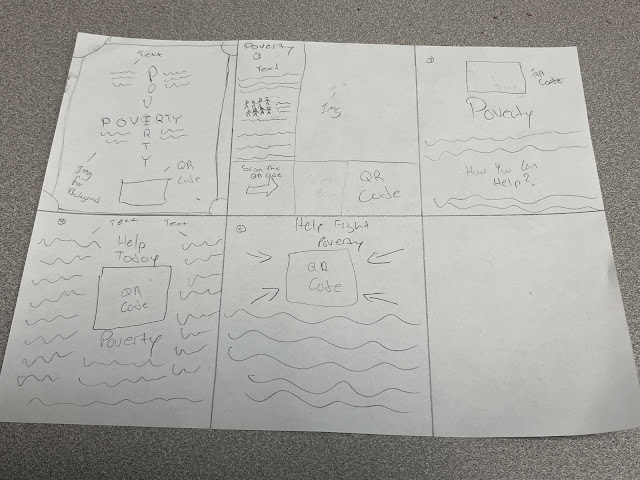
 Poster Rough So what I plan on doing for my Call To Action Poster is to add images of people facing poverty and also adding a QR Code to get people involved in helping solve the issue of poverty. I also plan on adding many other ways they can help fight poverty on the poster by making a list. I plan on adding the definition of poverty n the posters and add a hand drawing on the QR Code to represent giving or receiving donations.  

Social Justice Poster Research

Image
Posters The way how posters work is that people promote a event or a message by writing it or drawing it on a big piece of paper and they later put it on public area where people will take a glance at it. The poster must be eye catching so it can grab peoples attention. The reason why some posters may fail is because it could be too vague or simple which doesnt get peoples attention. Some of the elements that a poster needs us Typography, Color, Shape, Contrast, Creativity, Target Audience and many more. These posters might impact my poster design by giving me an idea of what colors work well together and what type of Type Hierarchy I should use. What makes the first image so unique is how there is different font sizes being used and how the letters are placed on the poster. It shows a connection between the big letters and the small letters like the big letter W connects with ORK making it WORK. This Poster shows a very intense drawing of a glass with liquid in it. It shows like an ex

Designing Symbols for Change

Image
What did you learn by discussing the evolution of the accessibility symbol? What I learned from discussing the evolution of the accessibility symbol is that I learned that the original sign was made around the 1960's and it recently changed around 2010. I learned that its important to keep the symbol simple so everyone can understand it. What did you learn in by discussing the symbols of Olympic sports? What I learned from discussing the symbols of the Olympic sports is that in the early years they designed a symbol inside a box which limited the size of the symbol. Later on they stopped using the box to draw better and bigger images without the restriction of the box. I also learned that the symbols need to designed in a way that will help every person from different nations to understand. What were your other impressions of this exhibition? Some other impressions that I have about the exhibition is that I liked the the room that showed many different objects on the shelf. And I a

Social Justice Research

Image
My social justice project will be about poverty. I will put out information about the conditions that a persons have to deal with when they are facing poverty. What I like about the image shown below is it shows a person being able to drink clean water with an invention that helps filter water and remove all the bad stuff from the water making it clean and consumable. This shows how people are not ignoring the issue of poverty and are creating things such as straws that help filter out water making it consumable. To me the image gives the audience a strong message. Poverty is when a person doesn't have access to: Food Water Transportation Clothes Around 720 Million people from around the world face poverty A project called Design For The Other 90% is helping those people living in poverty by designing low cost solutions that will help and benefit the people living in Poverty The font I plan On using is Ibarra Real Nova Font  I plan on using a 3x3 grid I plan on using dark colors 

Data Visualization

Image
  Data Visualization What I see on the " Countries with the largest immigrant population worldwide in 2020" Chart is a list of counties ordered from highest at the top to lowest at bottom of the amount of countries with the largest amount of immigration population. I also see that there are bars for each country and the higher the amount of immigrants each country has the bigger the bar will be for that country. I see that the United States has the highest immigration count and Kuwait has the lowest immigration count. https://www.nytimes.com/interactive/2022/05/23/health/covid-death-toll-world.html The way how Denise Lu and Eleanor Lutz presented the death rates during the pandemic was by using a chart that has a lot of countries on separated in High Income, Upper Middle Income and Low Income sections. I also see that each country has a bar that represents the percentage of deaths above normal. This person also used another graph that uses lines instead of bars to represent t

Social Justice

Poverty   Poverty is about not having enough money to meet the basic needs such as access to food, water, clothing and shelter. Many people in face poverty due to unemployment, war and corruption.  One project that I found On Cooper Hewit that aims to help resolve this problem is the Design for the Other 90% which is a project that has engineers, teachers, students and designers who are looking for cost affective ways to increase the access of food, water, education and transportation for those who need them the most. Most of the world population don't have access to food and water and the goal of this project is to help those people.